
Panels: One-Page Responsive WP Theme
Resources
- Online Help File: http://themolitor.com/help/panels
- Video walk-throughs: http://youtube.com/themolitor/
- Support Forums: http://www.themolitor.com/forums/
- Customization Requests: http://themolitor.com/custom
- Theme Demo: http://themes.themolitor.com/panels
- Handy Plugins:
- Contact Form 7: http://tinyurl.com/2hjj5x
- Display Widgets: http://tinyurl.com/y9wj8gs
- Twitter Widget Pro: http://tinyurl.com/ygzhxu2
- WP Super Cache: http://tinyurl.com/375zv9
- Advanced Recent Posts Widget: http://tinyurl.com/d4mrcp9
- Free Background Patterns: http://subtlepatterns.com
Theme Installation
- Download and unzip the folder from ThemeForest.
- Upload the theme folder (with the "style.css" file inside) to the themes directory of your blog, which is located within the wp-content directory.
- Activate the theme from your admin panel by navigating to "appearance" > "themes".
- NOTE: If you get a message like “stylesheet missing” (it isn’t) or “broken theme” (it’s not), please read this post: http://tinyurl.com/75qmrxa
- Options will be accessible from “appearance” > “customize”.
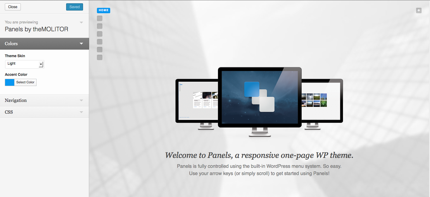
Theme Options
Theme options are controlled from the theme customizer panel. Once finished installing the theme, be sure to review the options available by navigating to “Appearance” > “Customize”.
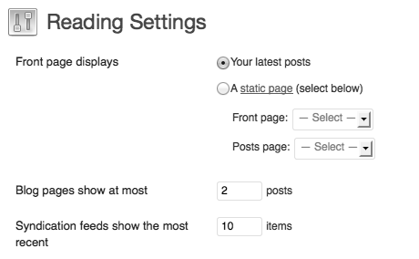
Home Page
By default the built-in home page for the theme will display. If you want a different page to display instead, navigate to the "reading settings" page and select the page in the "front page" drop down menu.
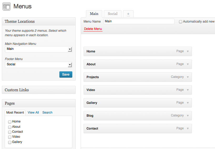
Organizing Vertical Panels
To organize your panels, navigate to “Appearance” > “Menus” and create a new menu named “Main”. Assign this menu to the “Main Navigation Menu” in the drop down (see image below). For more information and instruction, watch the “Using WordPress 3.0 Menu System” video here: http://tinyurl.com/48dozan.
NOTE: Only pages and categories are supported for the main menu. Also, sub menus are not support for the main menu.
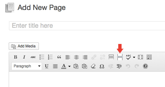
Creating Horizontal Panels
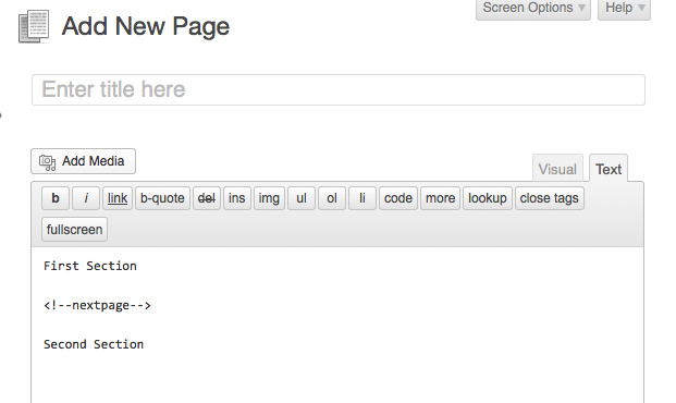
To create horizontal panels within a single vertical panel, use the "Insert Page Break" button in your page content box editor. If you're using the "text" tab editor (not the "visual" tab), use <!--nextpage--> to separate sections.
Visual Editor
Text Editor
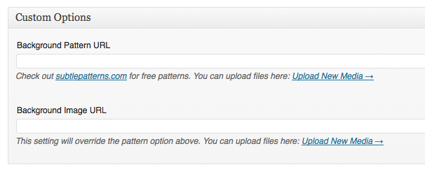
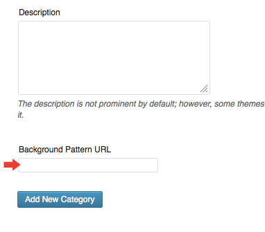
Custom Background Images/Patterns
To control the background image/pattern for pages, use the custom fields on the page edit screen (see first screenshot below). For categories, use the "Background Pattern URL" field on the category edit screen (see second screenshot below). Images can be uploaded from the "Add New Media" page (under the "Media" menu).
Page Edit Screen:
Category Edit Screen:
Number of Posts in Category Panels
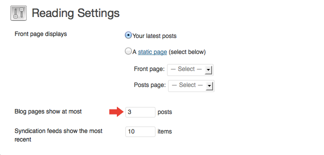
To control the number of posts that appear on category panels, navigate to "Settings" > "Reading" and adjust the "Blog pages show at most" number to your liking (see screenshot below). It's recommended that you use a number divisible by 3 (i.e. 3, 6, 9, etc) as the width is built for 3 posts per row.
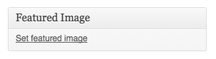
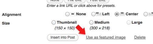
Featured Images
To feature images for posts, use the “Featured Image” section on the lower right side of the post edit page (see screenshot below). After uploading the image, select "Use as featured image". When uploading an image, it automatically creates all the different sizes for you.
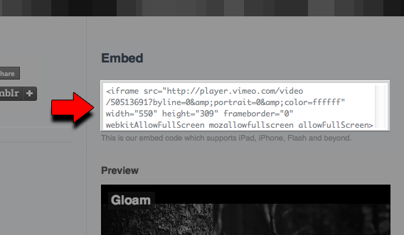
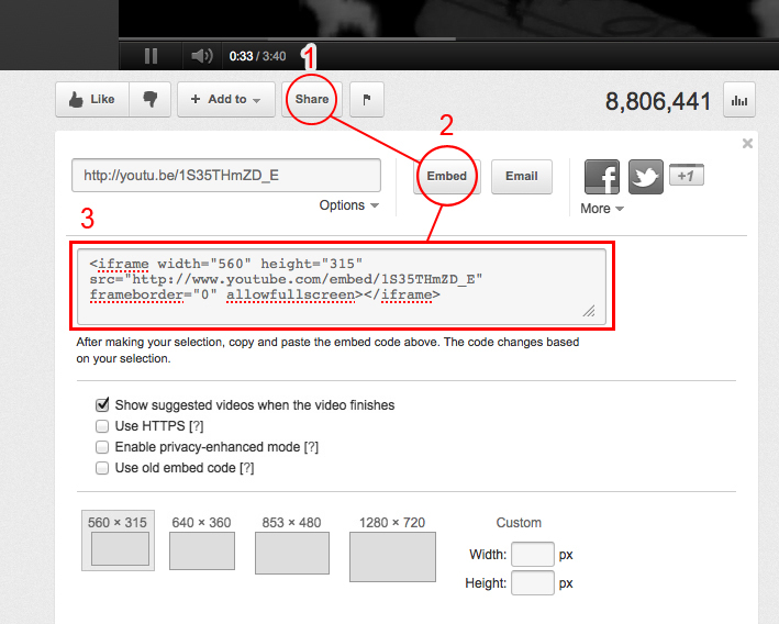
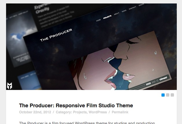
Embedding Video
Review the below screenshots for where you can find embed codes on sites like Vimeo and YouTube. Copy/Paste the embed code into the page/post content box. Keep in mind, when you're dealing with raw code like this make sure you're using the "HTML" tab (not the "visual" tab) on the WordPress page/post edit screen. NOTE: The maximum width for video embeds should be 700px.
Vimeo:
YouTube:
Slider Gallery
To create a slider gallery, simply upload images to the post. You DO NOT need to insert any shortcodes or images for the slider. NOTE: If you want to use an image in the post content, but don't want to have it show up in the slider gallery, simply use the "Media Upload" page to upload the image and not have it attached to the slider.
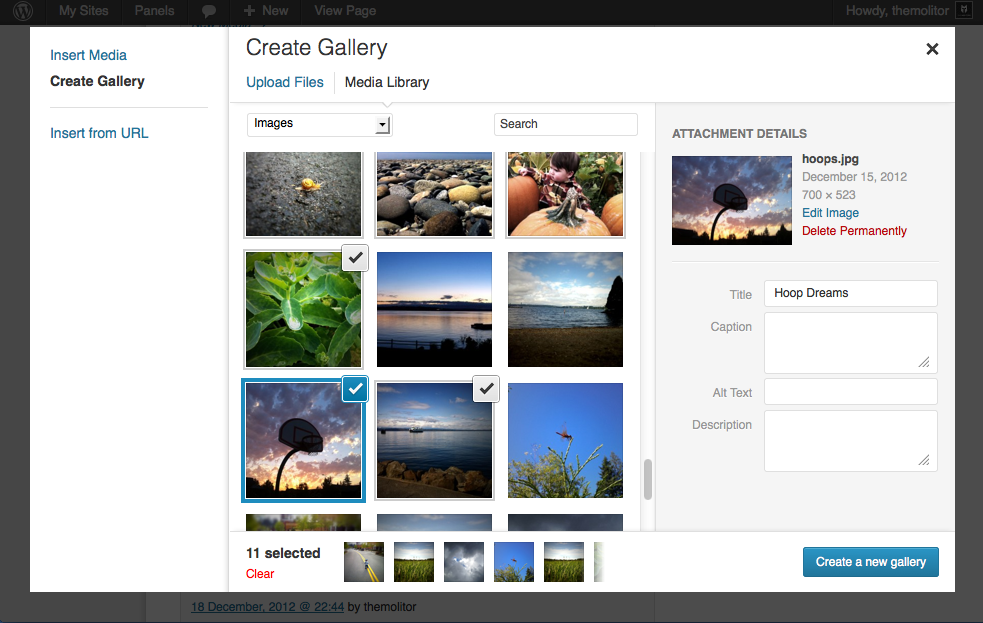
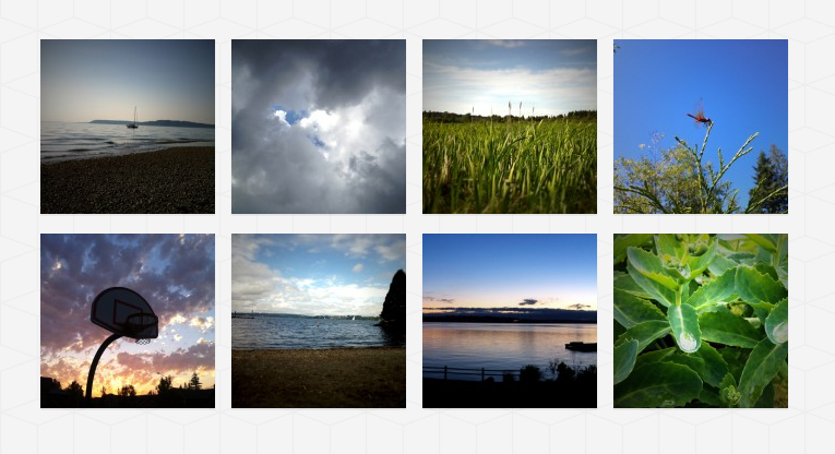
WordPress Grid Gallery
To create an image gallery, simply upload images to a page/post. Click "Create Gallery" and select the images you want in the gallery. When finished, click "Create a new gallery" in the lower right. Then click "insert gallery" in the same location.
Widgets
The widgets section is controlled from the "widgets" page (under "appearance").
Comments
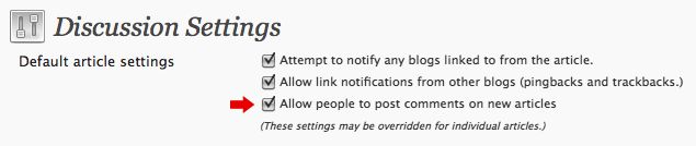
- Turn off comments site-wide:
- Navigate to "settings" > "discussion" and uncheck the allow comments box...
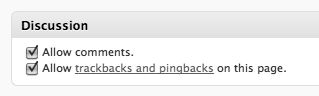
- Turn off comments for a specific post/page:
- Uncheck the box in the discussion panel...
- If you don't see this, you can turn it on by clicking "screen options" and checking the box to display discussion options...
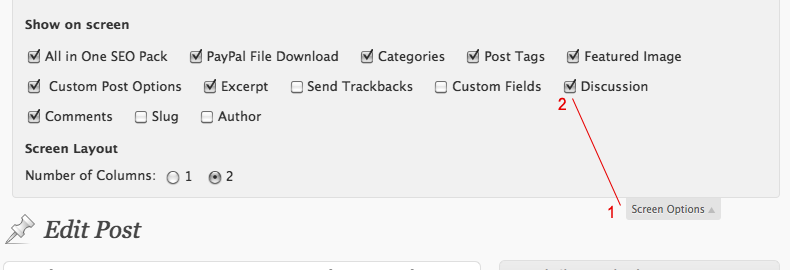
Image Lightbox
This theme uses PrettyPhoto as a lightbox system for images. You can make images show up with the light box by adding rel=”prettyPhoto” to the links. For more info, check out the PrettyPhoto website: http://www.no-margin-for-errors.com/projects/prettyphoto-jquery-lightbox-clone/
Shortcodes
This theme has the below shortcodes built into the theme. For a live demo of these shortcode, click here
- [icon class=""]
- Creates a font icon.
- Class is the name of the icon. List of icons available here
- Example: [icon class="icon-download"]
- [divider top="" bottom="" color="" style="" width=""]
- Creates a horizontal divider to separate content on page. All settings are optional.
- Top and bottom determine top and bottom spacing of the divider (defaults are 0).
- Color is the hex value you want to use for the divider (default is #eeeeee).
- Style is the border style you want to use (default is solid).
- Width is the border width you want to use (default is 1).
- Example: [divider top="20" bottom="20" color="#ccc" style="double" width="4"]
- [gmap src="" width="" height=""]
- Displays a Google Map.
- The "src" is the URL to the map.
- Width and height are optional (default values are 700x400).
- Example: [gmap src="http://maps.google.com/maps?q=seattle&ll=47.606163,-122.332077&spn=0.010011,0.022724&oe=utf-8&client=firefox-a&channel=fflb&hnear=Seattle,+King,+Washington&gl=us&t=m&z=15"]
- [skill level="" title=""]
- Creates a progress bar indicating your skill.
- Level indicates percentage of the skill.
- Title is the name of the skill.
- Example: [skill level="80" title="PHP"]
- [div class="" top="" right="" bottom="" left="" align=""][/div]
- Creates a div containing the content inside the shortcode tags.
- Class allows you to assign a name for CSS styling purposes (optional)
- Top, right, bottom and left determine spacing of the div (defaults are 0).
- Align is the text alignment of the div content (default is left).
- Example: [div top="20" bottom="20" align="justify"]content inside div here[/div]
- [divinside top="" right="" bottom="" left="" align=""][/divinside]
- Creates a div containing the content inside the shortcode tags. This is helpful if you want another div inside a div shortcode used above
- Top, right, bottom and left determine spacing of the div (defaults are 0).
- Align is the text alignment of the div content (default is left).
- Example: [div top="20" bottom="20" align="justify"]content inside div here[/divinside]
- [clear]
- This shortcode outputs <div class="clear"></div>
- The is useful when floated images/text are causing layout issues.
- [button color="" link="" size="" new="" light=""][/button]
- Creates a button link as opposed to just a plain text link.
- Color is the hex value to be used for the background of the button (default is theme accent color selection).
- Link is the url of the button to be used.
- Size is the sizing you want to use. Options are large, medium and small (default is large).
- New determines if the link opens in a new window/tab. True means a new window (default is false).
- Light determines if the button has a light background and renders the text darker (default is false)
- Example: [button color="#234532" link="http://themolitor.com/example" size="medium"]Button text[/button]
- [menulink menu=""][/menulink]
- Menu links allow you to access the main menu tabs from anywhere on the site.
- menu is the position of the menu item you want to select (i.e. 1, 2, 3, 4, 5, etc).
- Example: [menulink menu="3"]Link text[/menulink]
- [pagelink page=""][/pagelink]
- Pagination Links allow you to access the different sections of the currently active menu tab.
- page is the pagination link you want to select (i.e. 1, 2, 3, 4, 5, etc).
- Example: [pagelink page="3"]Link text[/pagelink]
- [toggle title="" open=""][/toggle]
- Toggles allow you to have a link that expands the content inside the shortcode.
- title is the name of the link.
- If open is set to "true" it is open by default (default is set to "false").
- Example: [toggle title="Title Text Here"]Toggle content here[/toggle]
- [slider width="" height=""][/slider]
- Slider is the required container for the "slide" shortcode below.
- width and height are optional.
- Example: [slider width="750"]Slide shortcodes go in here[/slider]
- [slide][/slide]
- This shortcode contains the slide content (requires the slider shortcode above).
- Example: [slide]Slide content here[/slide]
- [youtube id="" w="" h=""]
- This shortcode displays a video.
- W and H represent the width and height of the video. Default is w="750" and h="422".
- Example: [youtube id="asasdf23"]
- [vimeo id="" w="" h=""]
- This shortcode displays a video.
- W and H represent the width and height of the video. Default is w="750" and h="422".
- Example: [vimeo id="asasdf23"]
- [viddler id="" w="" h=""]
- This shortcode displays a video.
- W and H represent the width and height of the video. Default is w="750" and h="422".
- Example: [viddler id="asasdf23"]
- [dailymotion id="" w="" h=""]
- This shortcode displays a video.
- W and H represent the width and height of the video. Default is w="750" and h="422".
- Example: [dailymotion id="asasdf23"]
- 1/2 Columns
[one_half][/one_half]

[one_half_last][/one_half_last]
[one_third][/one_third]

[one_third_last][/one_third_last]

[two_third][/two_third]

[two_third_last][/two_third_last]
[one_fourth][/one_fourth]

[one_fourth_last][/one_fourth_last]

[three_fourth][/three_fourth]

[threee_fourth_last][/three_fourth_last]
[one_fifth][/one_fifth]

[one_fifth_last][/one_fifth_last]

[two_fifth][/two_fifth]

[two_fifth_last][/two_fifth_last]

[three_fifth][/three_fifth]

[three_fifth_last][/three_fifth_last]

[four_fifth][/four_fifth]

[four_fifth_last][/four_fifth_last]
[one_sixth][/one_sixth]

[one_sixth_last][/one_sixth_last]

[two_sixth][/two_sixth]

[two_sixth_last][/two_sixth_last]

[four_sixth][/four_sixth]

[four_sixth_last][/four_sixth_last]

[five_sixth][/five_sixth]

[five_sixth_last][/five_sixth_last]
JavaScript
This theme imports the following JavaScript files:
- jQuery: jQuery is a JavaScript library that greatly reduces the amount of code that you must write.
- Custom Scripts: The custom.js file provides some custom scripts for jQuery.
- PrettyPhoto: PrettyPhoto is a lightbox system for images. You can make images show up with the light box by adding rel=”prettyPhoto” to the links. For more info, check out the PrettyPhoto website: http://www.no-margin-for-errors.com/projects/prettyphoto-jquery-lightbox-clone/
- Backstretch: Allows the fullscreen image effect to work across all major browsers.
Changelog
v 1.1.3 - May 2015
* Added support for WordPress 4.2 sidebar requirements
* General code optimizations and improvements

v 1.1.2 - Nov 2013
* Added: Retina support.
* Added: "Show Main Menu Text" theme option.
* Added: "Show Pagination Numbers" theme option.
* Fixed: Error in .POT file for translation.

v 1.1.1 - Aud 2013
* Minor improvements.

v 1.1.0 - June 2013
* Added shortcodes and 300+ icon fonts

v 1.0.3 - Feb 2013
* Minor improvements.

v 1.0.2 - Feb 2013
* Minor improvements.

v 1.0.1 - Feb 2013
* Minor improvements.

v 1.0.0 - Feb 13
* Initial release.